Copile


Challange
The old dashboard was visually crowded and inconsistent. Important actions and metrics were competing on the same level, so users missed key information and complained about not knowing where to look. The layout also did not scale well, leaving unclear empty areas and weak content structure.
Result
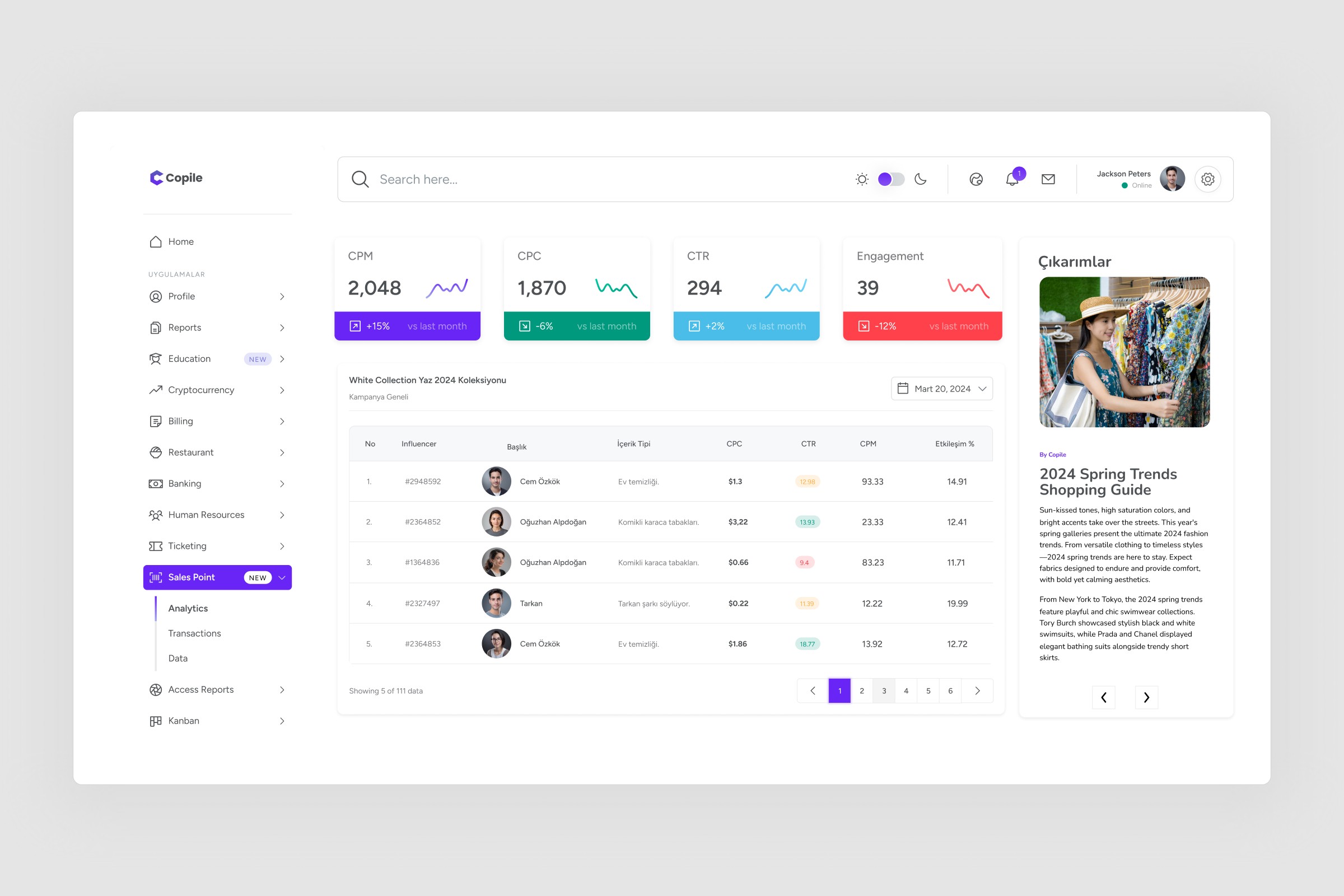
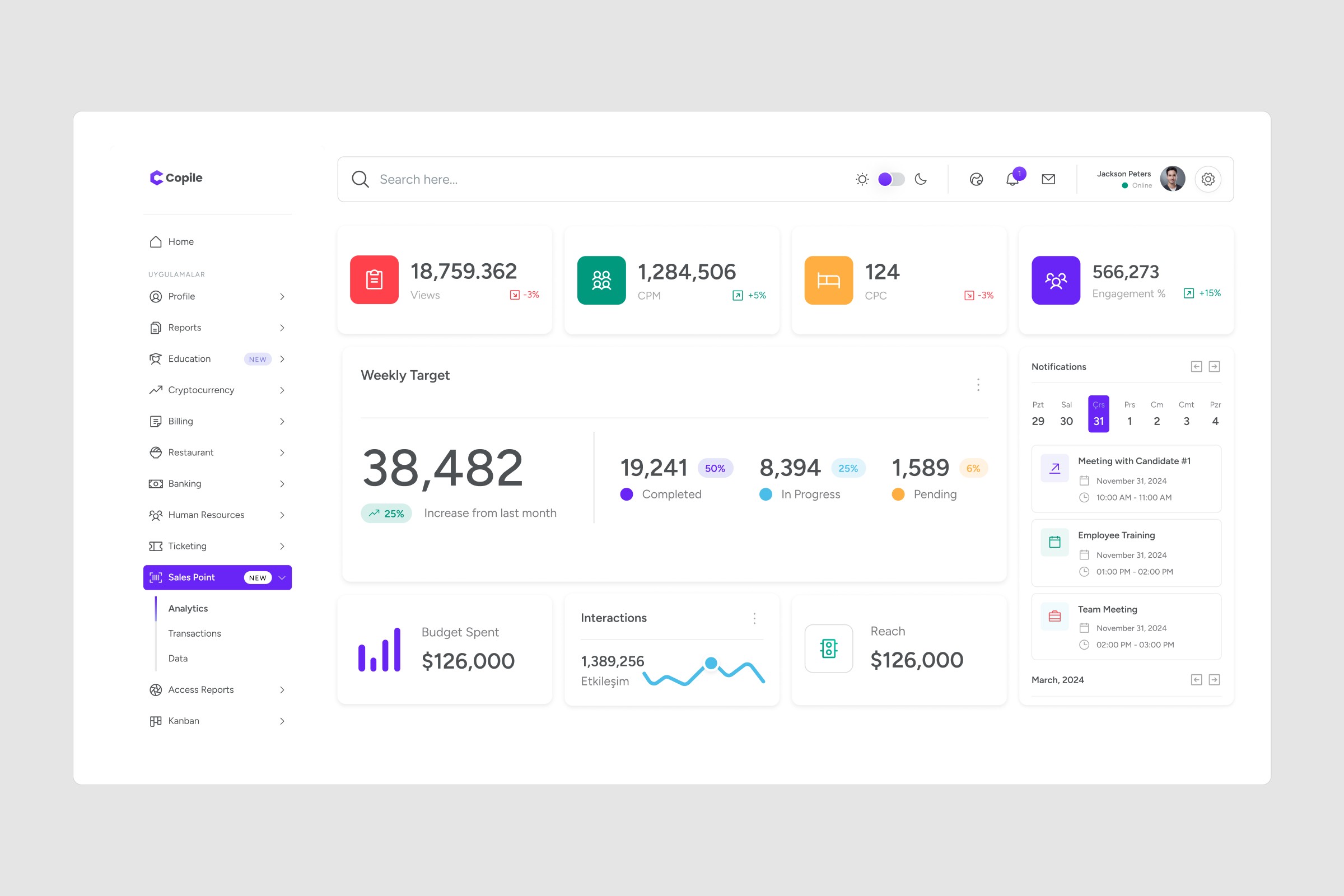
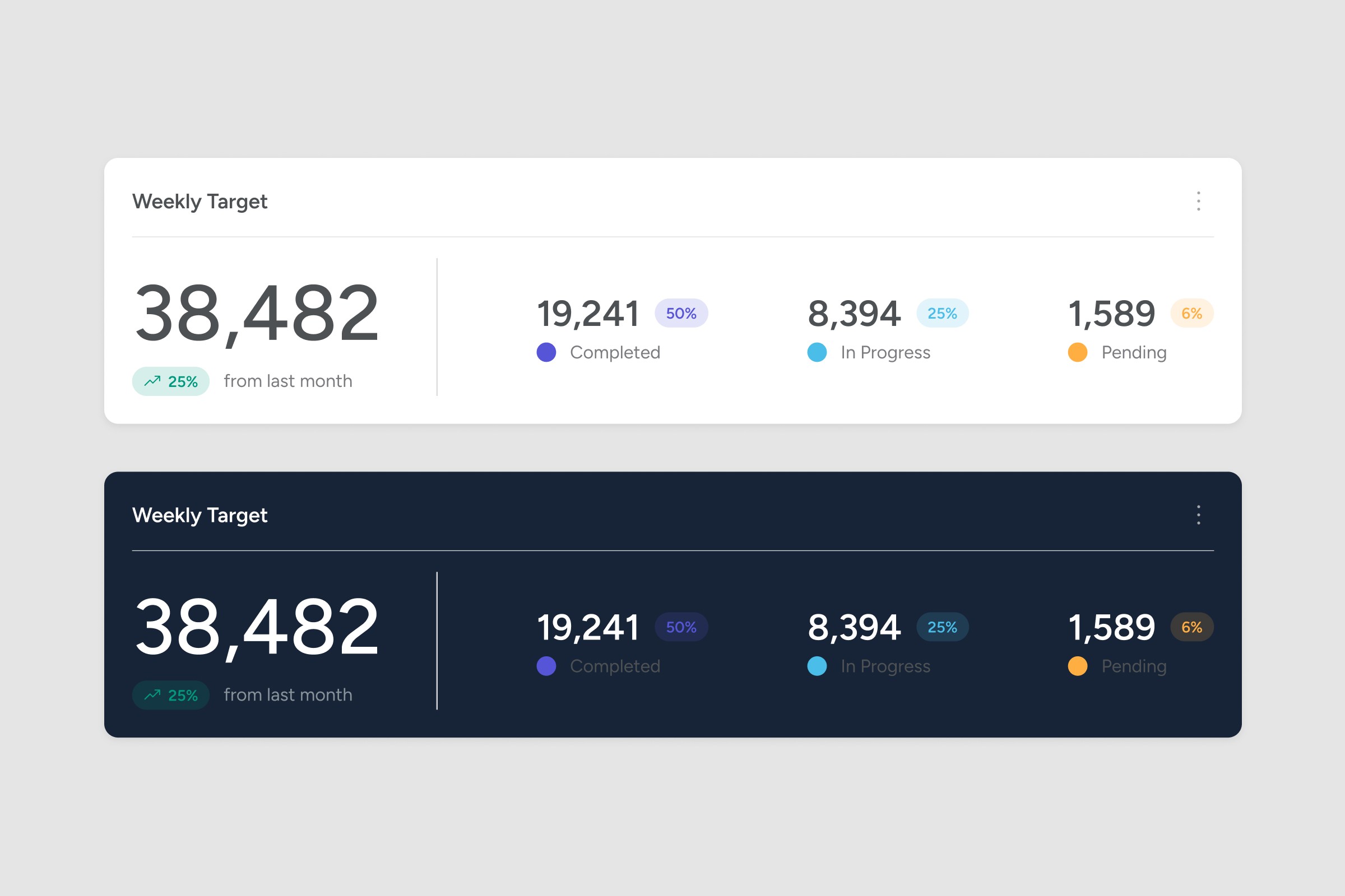
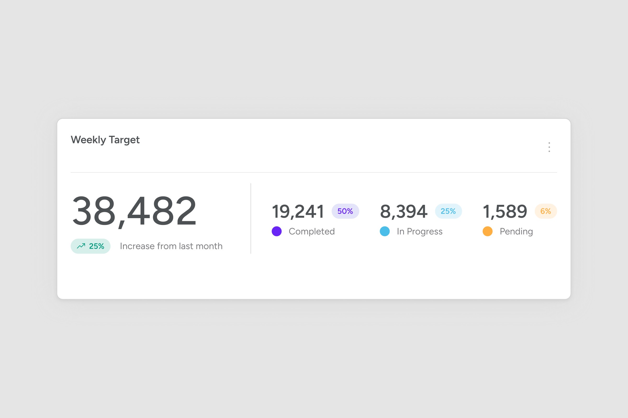
I rebuilt the dashboard with a clearer system: stronger hierarchy, cleaner spacing, and consistent components across the UI. Key metrics are now easier to scan, tables feel lighter, and navigation is more obvious. I also added a structured side panel area to support content and context without breaking the core workflow.
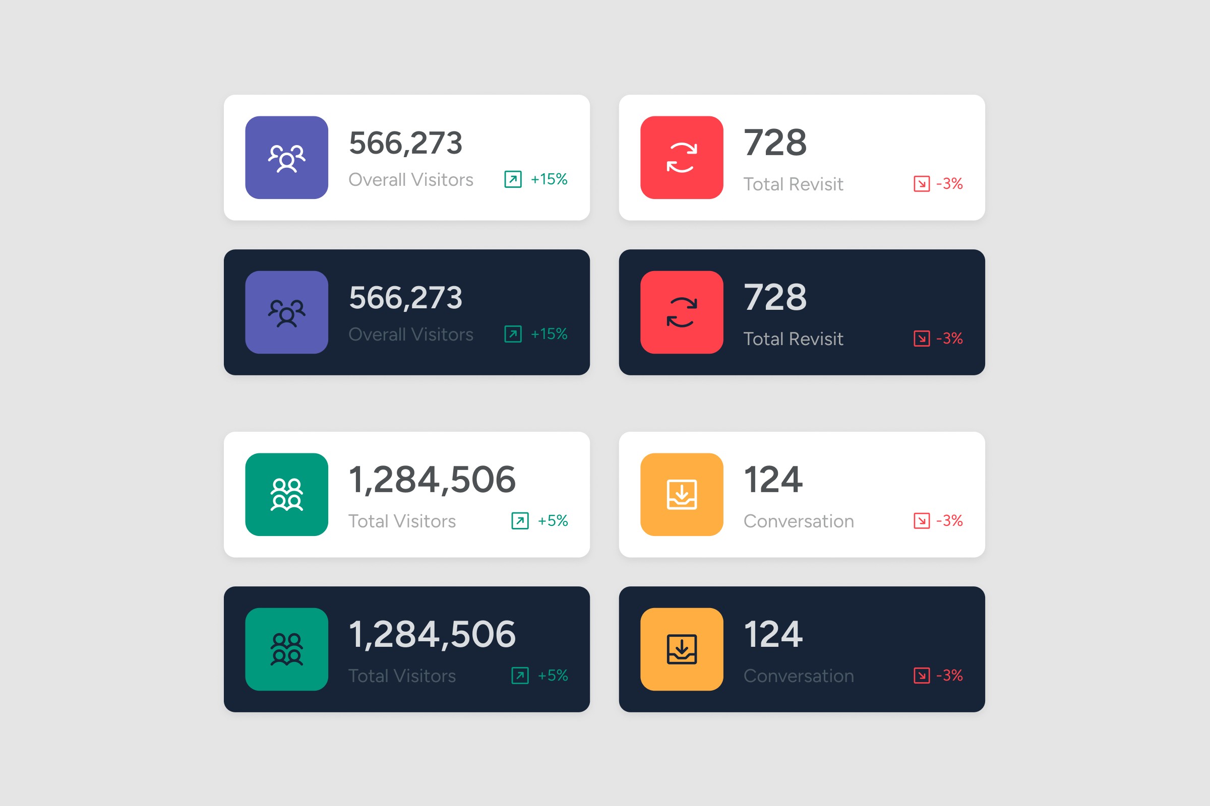
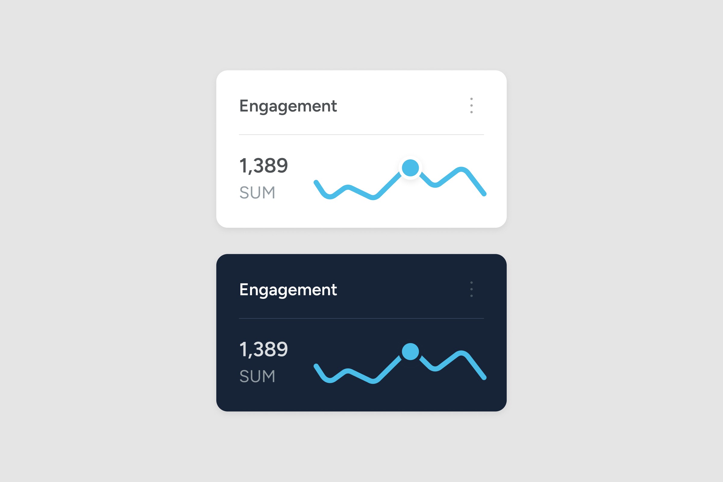
Clearer hierarchy
Users can scan metrics faster.
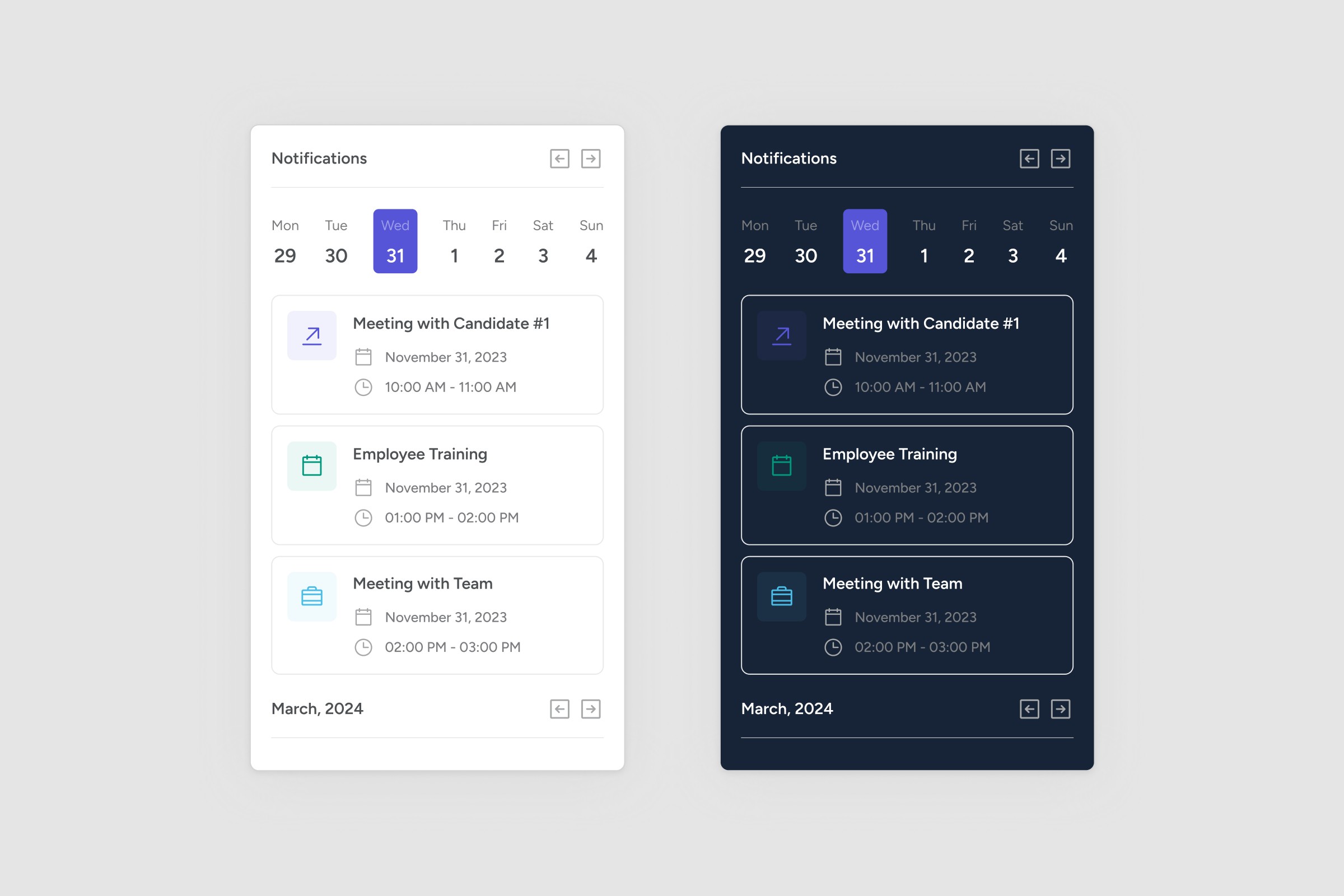
Cleaner navigation
Less confusion across sections.
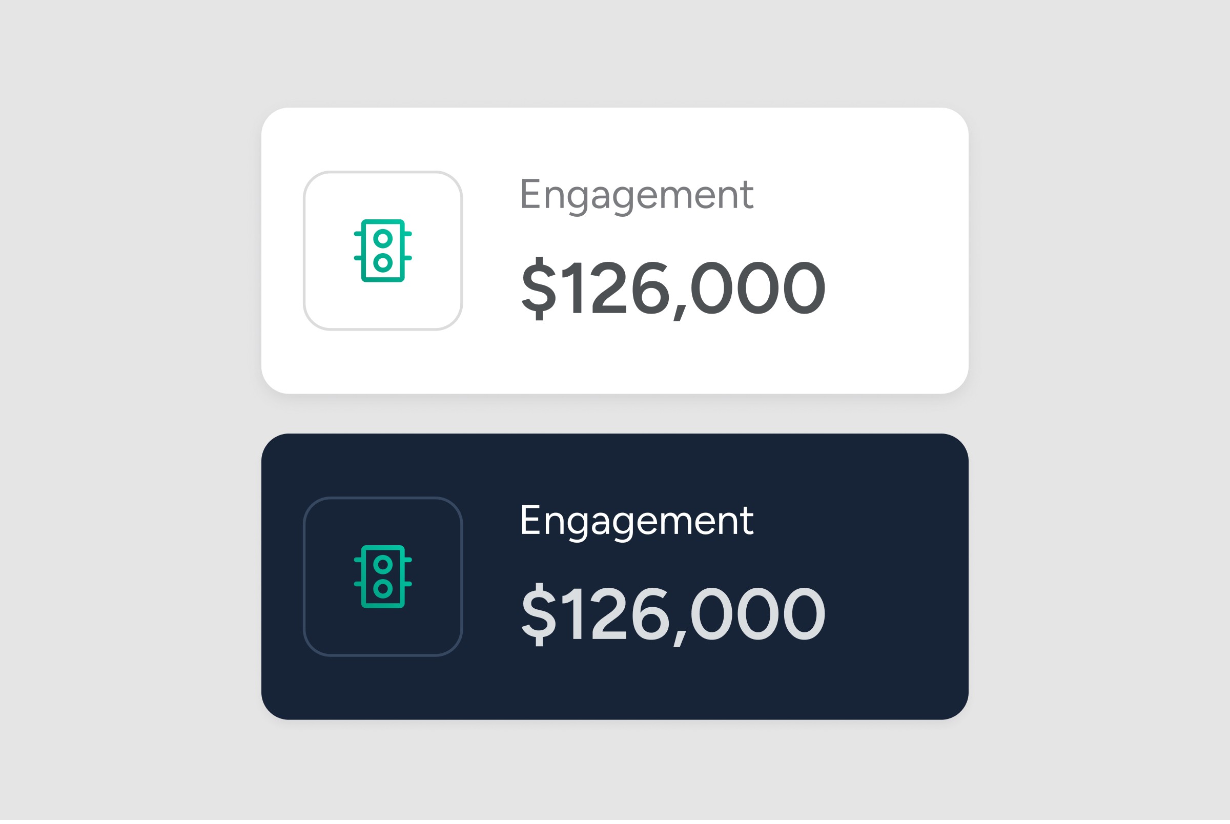
Consistent UI system
Reusable components and rules.